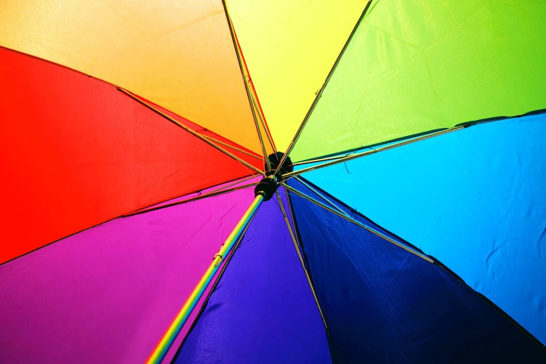
Generally speaking, we all can see colors in some way or another. However, rarely is it discussed or thought of as more than mere hues. This is a tragedy to the senses, because colors provide so much information to the human mind. Colors have the ability to inspire, motivate, and instill a deep feeling. With this in mind, it’s hard to say that color is a trivial thing. Indeed, color is something to be celebrated and explored in depth. That being said, in this article we are going to discuss color theory, and how this relates to arranging your jewelry or merchandise.
What is Color Theory?
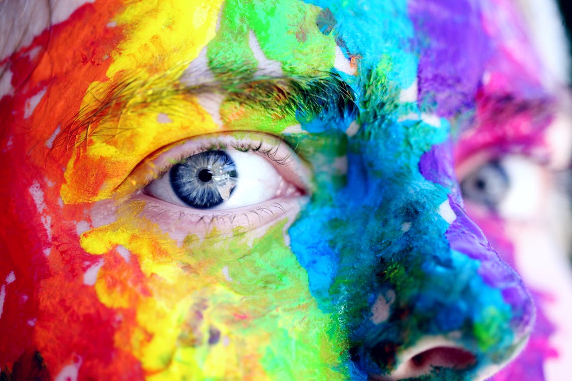
First things first, let’s touch on the main event: Color Theory. Color theory is a train of thought in which it is assumed that color can be arranged in such a way as to be aesthetically pleasing. Through this arrangement a message can be sent from designer to receiver. In other words, sorted colors can influence you. This is an AMAZING thought, and by all seen records has a lot of evidence backing this assumption. For example, red can make you hungry; whereas blue can calm you down. This is a fascinating concept, but let’s applies this to the heart of the issue: You.
You plus Color Theory Equals Smiles
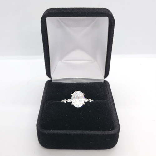
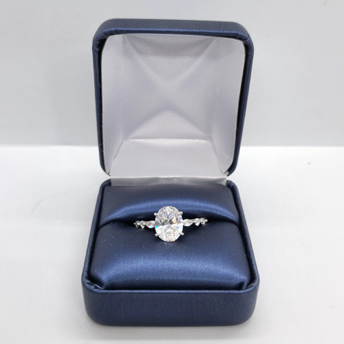
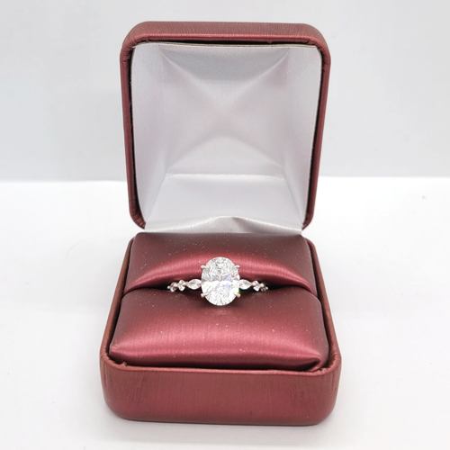
When properly understood, color theory can be harnessed as a useful and nearly vital marketing tool. Let’s look at some examples, and briefly compare and contrast the emotional response that the color pairing can bring. Let’s go with a fan favorite, blue versus red. See Figure 1.1
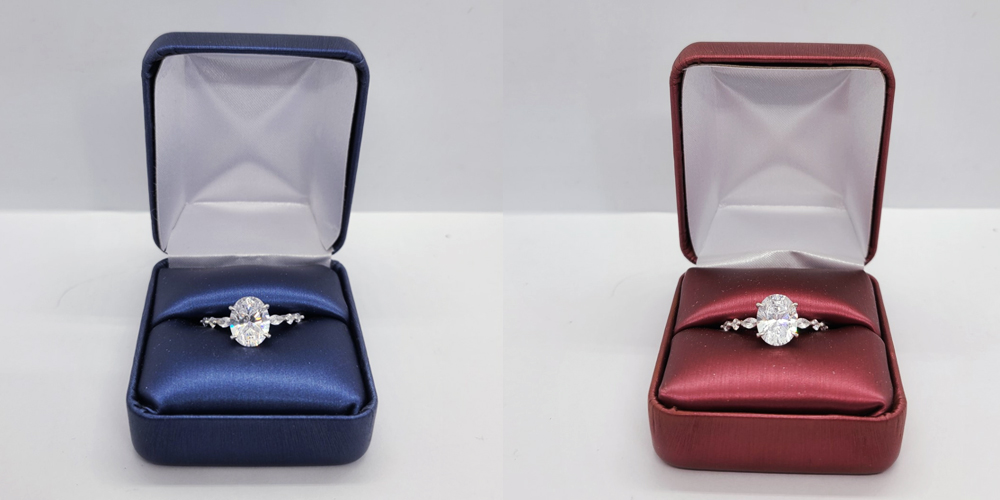
The first thing that I notice is the difference in the background color. However, the tone of the white box in real life is the same tone between the two photos. But how can that be? It’s an interesting concept called reflected light waves. Putting aside science talk, light bounces off of an item, influencing the tone of surrounding items. This is easier to see in a light box. Therefore, we can conclude that we you select a jewelry box color, not only does it influence the look and feel of the item contained within the box, but also the surrounding pieces.
Another quality to note is the reflection on the ring in the blue box appears to be more sparkly than the red box. This is because blue light has shorter wave lengths, and produces more energy (aka sparkliness) than the red counterpart. Red is in fact the OPOSITE of blue. Red has longer light waves and conversely produces less energy (aka LESS sparkliness). But why does this matter?
Trust Me Color Theory Matters
With the example in mind, imagine your jewelry case or window display. What are you trying to accomplish? Do you want the customer to just look? If mere attention is what you seek, than there are tons of obnoxious tactics you can employ (such as infamous sign twirlers). However, the message you are trying to convey may be lost in translation.
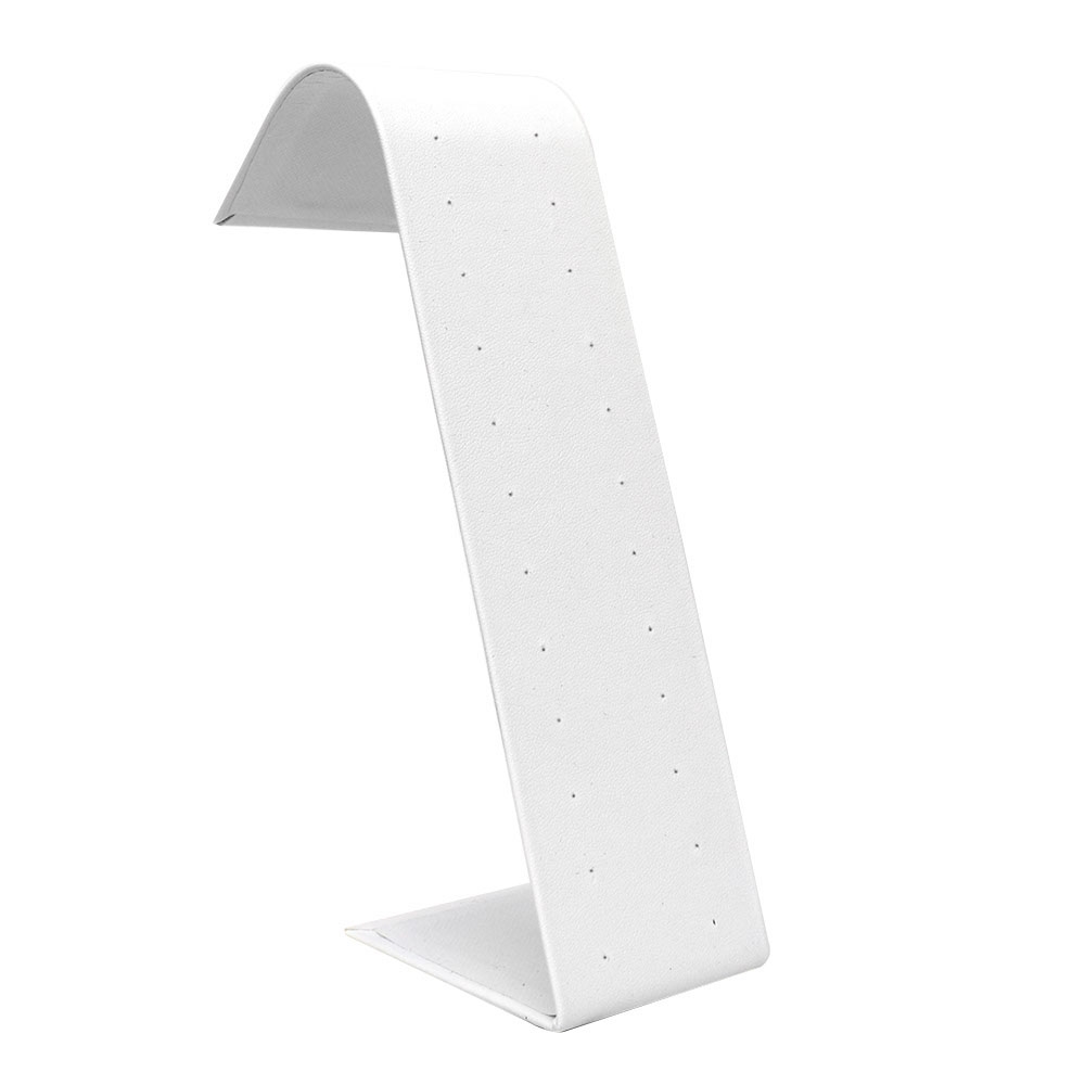
If you wanted to instill the look that your gemstones are the sparkliest bling than choosing a blue box is a great route to go. The blue box provides a stronger reflection, while maintaining that chill approachable feel. The redder box conveys a sense of urgency and may motivate a sale, especially around Valentine’s Day.
Fun Fact – Red makes things appear closer
Let Us Wrap This Up
Color is more to your business than you might have thought possible. Through this tertiary exploration we see that color influences the look and feel of your business. It can also provide motivation to your customers in closing a sale. So, the next time you’re looking to redo your shop front, take a moment and reflect on the color palette you select. Your inner fashionista will thank you for the consideration.
Like What You See?
If you enjoyed the jewelry boxes in this post, check them out on our site!