Unlock the Secrets of Color Schemes in Jewelry

Home » Visual Merchandising

Jewelry is more than just adornment; it’s a form of self-expression. From elegant necklaces to dazzling earrings, the colors we choose can significantly impact the overall look and feel of our accessories. Understanding color schemes in jewelry can elevate your style and help you create stunning combinations that reflect your personality. So, let’s delve into the world of color and uncover the secrets of harmonious jewelry design.

The Basics of Color Theory

Before we dive into specific color schemes, it’s essential to grasp the basics of color theory. The color wheel is a valuable tool that helps us understand how different hues interact with each other. Colors can be classified into primary (red, blue, yellow), secondary (orange, green, purple), and tertiary (red-orange, yellow-green, blue-purple) categories. Additionally, colors can be warm (reds, oranges, yellows) or cool (blues, greens, purples), depending on their undertones.

Monochromatic Magic

Monochromatic color schemes involve using variations of a single color. In jewelry design, this can create a sophisticated and cohesive look. For example, pairing different shades of blue sapphires or green emeralds can add depth and elegance to your ensemble. Monochromatic schemes are versatile and can be tailored to suit any style, whether you prefer subtle sophistication or bold statements.

Complementary Contrasts

Complementary colors sit opposite each other on the color wheel and create vibrant contrasts when paired together. In jewelry, this can mean combining hues like blue and orange or purple and yellow. The stark contrast between complementary colors adds drama and visual interest to your accessories. For instance, a pendant featuring a deep amethyst paired with citrine accents can create a striking focal point.
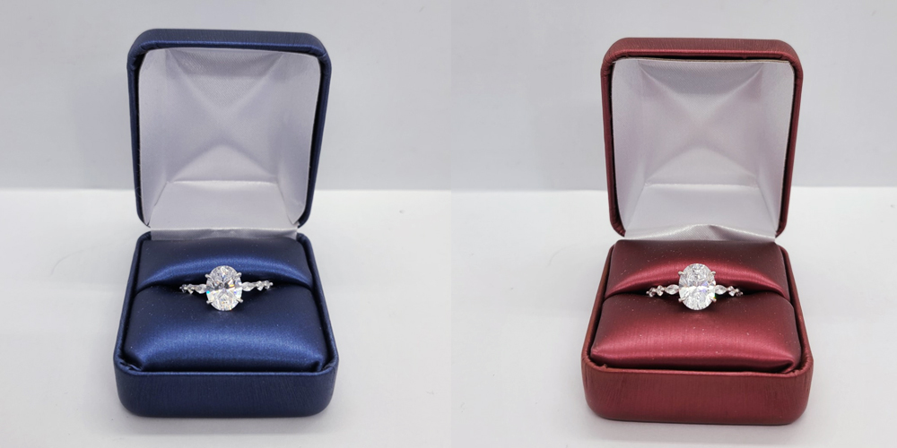
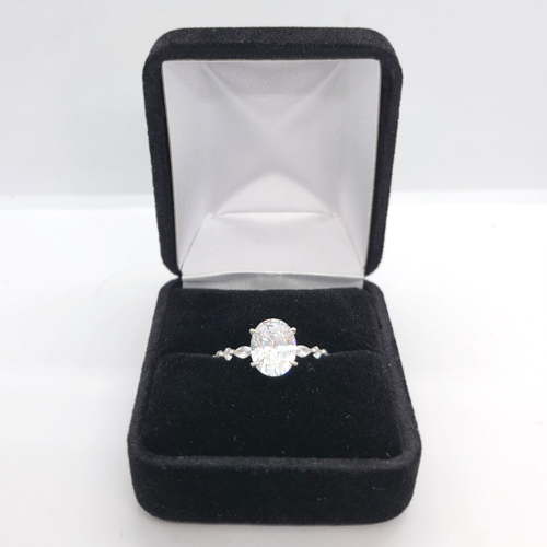
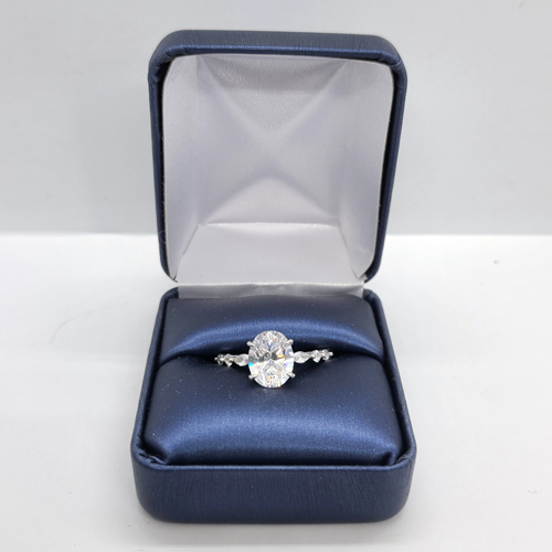
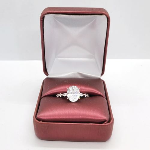
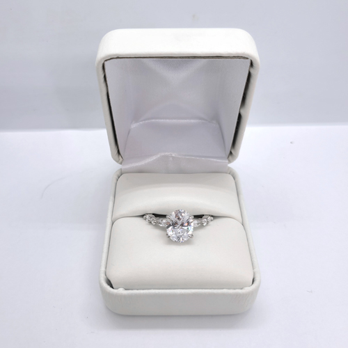
Neutral Elegance

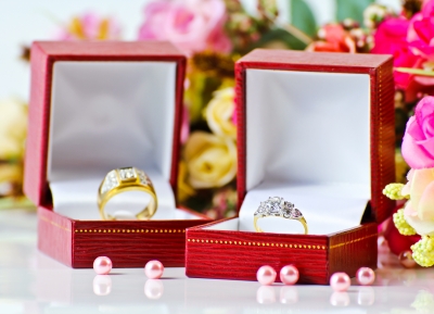
Neutral colors such as white, black, gray, and brown can serve as the perfect backdrop for showcasing vibrant gemstones. In jewelry design, neutral tones can add sophistication and versatility to your accessories. Whether it’s a classic pearl necklace or a sleek diamond bracelet, neutral hues provide a timeless elegance that complements any outfit.

Conclusion

In conclusion, color plays a vital role in jewelry design, influencing the overall look and feel of your accessories. Whether you prefer monochromatic elegance, complementary contrasts, or bold triadic schemes, understanding color theory can help you create stunning combinations that reflect your individual style. So, go ahead, explore the endless possibilities of color, and let your jewelry be a true reflection of who you are.

Posts


See Past Simple Colors – Explore Color Theory

Home » Visual Merchandising

Generally speaking, we all can see colors in some way or another. However, rarely is it discussed or thought of as more than mere hues. This is a tragedy to the senses, because colors provide so much information to the human mind. Colors have the ability to inspire, motivate, and instill a deep feeling. With this in mind, it’s hard to say that color is a trivial thing. Indeed, color is something to be celebrated and explored in depth. That being said, in this article we are going to discuss color theory, and how this relates to arranging your jewelry or merchandise.

What is Color Theory?

Color theory in photos

First things first, let’s touch on the main event: Color Theory. Color theory is a train of thought in which it is assumed that color can be arranged in such a way as to be aesthetically pleasing. Through this arrangement a message can be sent from designer to receiver. In other words, sorted colors can influence you. This is an AMAZING thought, and by all seen records has a lot of evidence backing this assumption. For example, red can make you hungry; whereas blue can calm you down. This is a fascinating concept, but let’s applies this to the heart of the issue: You.

You plus Color Theory Equals Smiles

When properly understood, color theory can be harnessed as a useful and nearly vital marketing tool. Let’s look at some examples, and briefly compare and contrast the emotional response that the color pairing can bring. Let’s go with a fan favorite, blue versus red. See Figure 1.1

Figure 1.1

The first thing that I notice is the difference in the background color. However, the tone of the white box in real life is the same tone between the two photos. But how can that be? It’s an interesting concept called reflected light waves. Putting aside science talk, light bounces off of an item, influencing the tone of surrounding items. This is easier to see in a light box. Therefore, we can conclude that we you select a jewelry box color, not only does it influence the look and feel of the item contained within the box, but also the surrounding pieces.

Another quality to note is the reflection on the ring in the blue box appears to be more sparkly than the red box. This is because blue light has shorter wave lengths, and produces more energy (aka sparkliness) than the red counterpart. Red is in fact the OPOSITE of blue. Red has longer light waves and conversely produces less energy (aka LESS sparkliness). But why does this matter?

Trust Me Color Theory Matters

With the example in mind, imagine your jewelry case or window display. What are you trying to accomplish? Do you want the customer to just look? If mere attention is what you seek, than there are tons of obnoxious tactics you can employ (such as infamous sign twirlers). However, the message you are trying to convey may be lost in translation.

If you wanted to instill the look that your gemstones are the sparkliest bling than choosing a blue box is a great route to go. The blue box provides a stronger reflection, while maintaining that chill approachable feel. The redder box conveys a sense of urgency and may motivate a sale, especially around Valentine’s Day.

Fun Fact – Red makes things appear closer 

Let Us Wrap This Up

Color is more to your business than you might have thought possible. Through this tertiary exploration we see that color influences the look and feel of your business. It can also provide motivation to your customers in closing a sale. So, the next time you’re looking to redo your shop front, take a moment and reflect on the color palette you select. Your inner fashionista  will thank you for the consideration.


Like What You See?

If you enjoyed the jewelry boxes in this post, check them out on our site!

To Catch a Moment – Gift Giving

Home » Visual Merchandising

Intro

From Me To You

Captivating a moment in time is a difficult and tricky goal. Although a lofty concept, it can be achieved with proper planning, consideration, and reflection. One often overlooked element of captivating a moment, particularly with proposing or gift giving in general, is the jewelry box. No one can argue that most commercial jewelry comes with a jewelry/merchandise box as a standard. This is a nice consideration from the jewelry, however, sometimes these boxes are a little tacky for the situation. After all, ideally you should only have to propose once. With that in mind, why not select a box that matches your loved one? For example, you can rebox the jewelry or gift in a nice lighted box, a real hardwood box, or imprint a special one of a kind message on the box. All of these little touches add enormously to the moment. Let’s elaborate on those three topics there in further detail. To reiterate: selecting a box or imprinting a box to tailor it to your loved one’s tastes.

Picking That One Out Of A Crowd

See Our YouTube Shorts For More Ideas

Selecting a jewelry box may seem like an unnecessary step, but the special moment would beg to differ. Typically a jewelry box is shipped with a box of its own. No one can argue that this is a nice and considerate gesture from the jewelers. However, sometimes these boxes are a bit simple, such as a plastic hinged box or a generic cotton filled box. These boxes are great for shipping, but may not offer that luxury one-of-kind feel you are trying to achieve. In this case, it’s nice to explore more interesting and dynamic options. One interesting box that Gems On Display offers is a hardwood black box. It’s easy to captivate hearts with its sleek design. This stunning ring box is the perfect companion for your precious jewelry.  Its glossy black exterior exudes a timeless charm that will make any ring shine even brighter. Opening this exquisite box reveals a plush velvet interior, carefully designed to cradle your most treasured items. That one aside, you may not need a pack of jewelry or merchandise boxes. Fair enough. One very amiable and unique option is a lighted box. These boxes are SO rare in the industry. This special design only adds to the moment. The light plays on the curves of the jewelry, which adds to the reflection, gloss, and look of the piece. After all, a diamond only sparkles in the light. These are far from the only options of a remarkable box. To give you a handful of different options there are: hard wood, clear view, leatherette, bronze, and so much more. So, when repackaging a gift or proposal ring, keep these little details in mind. It might add to the moment more than you would think.

You Could Always Print It

Printed Options

Another option to consider is printing on the gift box. As stated above, most jewelers include a gift box with their logo. This is a very nice gesture, however isn’t it more considerate to your loved one to include a special message to them directly. This exudes the feel of a remarkable moment for that one and only person. There are numerous statements that can go on a gift box. Some of these include a special date, a beloved song, a saying, or simple initials. At the end of the day, most of us throw gift boxes away or repurpose them. However, with this special touch, not only with the gift be a cherished reminder of the moment, but also the gift box in which it was given. Gems On Display does offer this service. Although our minimums start at 200 pieces, an amount below this target is also acceptable. There would be a $36 set up fee that would apply, but this would bring the cost of a custom gift box to approximately $50 give or take a bit depending on the style of box selected. This may seem like a tall order, but when taking into account the price of the gift, $50 isn’t as steep, and the added ambience to the moment is immeasurable. Of course, this is up for you to decide.

Let’s Wrap It Up

Whether you’re planning a romantic proposal, celebrating an anniversary, or simply cherishing a special moment, an exceptional box offers an extra touch of enchantment to the occasion. It’s a true keepsake that will be cherished for a lifetime.

For More Ideas, Check Out Some Unboxing Videos

Custom Printed Tags – A Powerful Tool

Home » Visual Merchandising

Presentation is everything. Displaying a certain look and feel is important for your small business. From the intricate designs to the exquisite craftsmanship, every detail matters to you and your customers. One often overlooked aspect of jewelry packing that can significantly enhance the overall presentation and marketing of your jewelry pieces is a custom merchandise/jewelry tag. I think we can all agree, plain tags are no longer acceptable to the average consumer.  Enter the world or custom printed tags, a powerful tool that not only adds a professional touch but also elevates your brand identity. Let’s explore the myriad benefits of printed jewelry tags and how they can help you leave a lasting impression on your customers and what they can offer for your business.

15X15-Circle-SWH

One aspect of tags is the branding opportunity. Custom printed merchandise tags offer an opportunity to showcase your brand identity or company ‘feel’. By customizing your tags with your company colors, unique texture or other design elements, you can reinforce your business brand’s identity. When customers see your tags, they will recognize and associate them with your brand, increasing recall and loyalty. This is a great marketing tactic. Another point to touch on is the opportunity to stand out from the crowd. Designing your tags that reflect the unique style and personality of your jewelry brand is an affordable investment with the potential of a high return in brand recognition. Experimenting with various shapes, sizes, materials, and finishes can create a truly distinctive tag that captures attention and leaves a lasting impression.

15X3125-KT

Tags can also display a certain type of commitment for your company in one of two ways. The obvious way is printing your company motto on your tags. Another way is selecting a tag that is tailored to your company’s vision. For example, if you are committed to a sustainable form of packaging, a 100% recyclable tag would be a good option. Whereas, investing in high-quality printed jewelry tags demonstrates your commitment to professionalism and attention to detail. The tag itself becomes a reflection of the craftsmanship and quality of your pieces. With a well-designed and well-printed tag, you convey a sense of trustworthiness and reliability, assuring customers that they are purchasing a product of the highest standards. You also have the opportunity to convey information about the product’s back story.

175X05-MBK

Printed jewelry tags provide an ideal platform to communicate essential information about your products. You can include details such as the metal type, gemstone details, care instructions, and any certifications or hallmarks. This not only educates your customers but also enhances their understanding of the value and uniqueness of your jewelry.  Printed jewelry tags can be a powerful marketing tool. Consider including your website or social media handles on the tag, encouraging customers to engage with your brand beyond the point of purchase. You can also use tags to promote upcoming collections, special offers, or exclusive events, creating anticipation and encouraging repeat business.

Custom printed jewelry tags are a small yet impactful detail that can transform the way your jewelry brand is perceived. By investing in quality design and printing, you can enhance your brand identity, communicate vital information, and create a memorable customer experience. Take advantage of this versatile marketing tool to elevate your jewelry pieces and leave a lasting impression on your customers. With printed jewelry tags, your brand will shine and stand out in the competitive world of jewelry.

2 Display Arrangements You NEED To Check Out

Before a customer even sets foot in your store, the first things they see are your window displays. These displays need to reflect your business, but sometimes a theme can get stale. I (like many others in the Jewelry Biz) love to explore options I may not have considered previously. Specifically, I enjoy putting an amazing signature look together. Achieving this signature style does not have to cost a fortune. In fact, IÔÇÖve crunched the numbers here for you and offer some exciting options for your next display and packaging arrangement.

  • Black Leatherette With a Coordinating Box

I am in LOVE with the modern style I see sprouting up in my shops and local restaurants. Less is becoming more in this ever evolving fashionista driven world. What better way to make a statement with the sleek and humble black leatherette line? This collection offered by Gems On Display can be found HERE.

To make a cohesive display arrangement, itÔÇÖs best to have a dimensional depth to your window displays. I personally recommend the 189-2L (BK).

This display is such a statement piece. The gentle curves and fantastic base are SO characteristic to the modern style. This display should be a SPECIAL display for a SPECIAL piece. The quality is felt in the hand on this display as well, VERY well put together. Overall, itÔÇÖs a remarkable display.

Necklaces usually pair with a set of earrings, bracelets and more. For the front of the arrangement, I recommend the 210-A, 218-2AL (BK), and the 252-3 (BK)

These displays have a pleasant and tasteful height variance. Gorgeous overall, and easy on the pocket book. An arrangement like this only costs around $60.

The arrangement doesnÔÇÖt end there though. How will your customers take home their new statement pieces? Fortunately, Gems On Display offers a WIDE variety of jewelry boxes. I would recommend either the Classic Model Series, which is a simple leatherette box. ItÔÇÖs a timeless classic. These boxes just DONÔÇÖT go out of style. If you want something a little more versatile though, a cotton-filled box is a great route to go as well. Both box styles have the option of custom printing, which adds that finishing touch to the entire arrangement. 

Overall, the modern display style is a great route to explore for someone who wants a timeless feel. 

  • Linen Displays, Wooden Displays, and Kraft Boxes

Summer-time fun-time. Who hasnÔÇÖt heard that in the jewelry making industry? I like to pair my summer time jewelry themes with cream colors or a natural wooden display. Gems On DisplaysÔÇÖ natural wood displays compliment the linen displays perfectly. To create a physically appealing display arrangement, I start with larger more statement displays either in the back or at the shoulder of the set. The PERFECT displays for this are: 101024 N, 101006 N, and the 181N LE.

With these 3 displays you can easily accent your statement pieces. The natural color of the wood and linen displays pair perfectly with tans, teals, sea foam, cyans, dark reds, and nearly every beach color scheme. 

As far as your front-most display arrangements, I really love keeping with that color theme. If I am displaying bracelets or earrings, there are a couple of options to explore from there. You can easily display earrings with a simple t-bar earring stand (ED-2401N-LE) and if I have any bracelets, I like to reiterate the wooden organic theme with another wooden bracelet ramp (383554 N).

Overall, this is an arrangement that you can tuck away for the season, and then re-use for the next summer-time season easily. These displays are sturdy as well as fashionable. As long as they are stored in a cool-dry environment, the materials stand the test of time very well, and overall are very easy to rework into a new display arrangement. For example, the wooden themed displays are not limited to a summer time theme. These wooden displays pair well with the white leatherette collection. With an arrangement like that, you can easily build a winter wonderland themed display arrangement that really turns head.

Summery

Your displays are your own. They need to reflect your individual and unique style. More so than that, a lasting theme is an investment. One display arrangement tastefully put together and gently used can last well over a year. The returns will speak for themselves. 

For more tricks and tips, check out our blog and YouTube Channel. We post inside tips weekly.

Spring Displays & Packaging

Spring is on the way! We donÔÇÖt know about you, but weÔÇÖre counting down the days until the weather warms up and we can see the ground again. In preparation for springtime days, we are are thinking about spring displays and spring colors.

Pantone’s Fashion Color Report Spring 2014 is a great place to begin. This will help you to see what colors are going to be trending this season, and you can choose what will match your jewelry and style the best. It will also help you highlight your pieces that might be similar to these colors or provide you with design inspiration.

When choosing a color scheme for your displays, don’t go overboard and use ALL the colors. You want your jewelry to be the focus and your displays and props should serve only to bring attention to your jewelry. And when you’re choosing your spring packaging line, remember that packaging is branding. You want to create a look that customers will associate with your store even after they’ve gone home.

Parade blue (very similar to the Dazzling Blue Pantone is featuring this spring) tissue paper paired with turquoise makes a memorable packaging look.

We know how many of our customers travel to shows, and one of favorite products for spring is this brand new carrying case! This black aluminum case has a front opening door with a pocket on the inside of the door, a hidden retractable handle, combination locks, and an adjustable divider. Holds up to (12) 1″ trays.

spring displays

For more color inspiration for this spring, check out our Pinterest Bring in Spring board.

When Creating Displays, Do You…

jewelry displays

When creating displays, do you…

…have varied display heights? You want your customersÔÇÖ eyes to naturally move along your entire display so that they see all of what you have to offer, and you can make this possible by not having all of your displays be exactly the same height. Here’s a great example.

…have a focal point in your display? A clear focal point is vital to a successful display. This doesnÔÇÖt mean you have all the same type of jewelry or product; it simply means that you have key spot in your display and build everything around that. This is the spot that will catch peoples’ eyes before they scan through the rest of your display. If there is no focal point, it will confuse customers and could result in fewer sales.

jewelry displays
Clear focal point. (Image courtesy of Feelart at FreeDigitalPhotos.net)


…choose display colors that enhance or distract from your jewelry? Color choice is very important. If you place white jewelry on a white background, it isnÔÇÖt going to stand out like white jewelry on a background. Similarly, if you have bright jewelry and bright displays, the effect could be overwhelming for your customers.

ways to display
Notice how the beige background is light enough to make the necklace pop without taking away from the jewelry?


…frequently change the displays in your store? If you have repeat customers and they always see exactly the same thing in your store window or display cases, theyÔÇÖll quickly lose interest. Keep things fresh and new by changing your displays at least 6 times per year (about every other month).

Visual Merchandising: An Eye for Color

Image courtesy of Ambro at FreeDigitalPhotos.net

You donÔÇÖt ┬áneed to have an eye for color to be able to put together an eye-catching display!

There are a few simple guidelines to follow when dealing with the colors in your displays. Keep reading for a few quick color basics to keep in mind when youÔÇÖre putting together your booth, window display, jewelry displays, or even your packaging colors! The colors you use in your displays will help dictate your customersÔÇÖ moods, and influence them to buy (or not to buy), so itÔÇÖs worth spending some time learning about how to effectively use color in your displays.

1. Have a knowledgeable use of color. ItÔÇÖs important to remember that specific colors are associated with certain industries or holidays. Even if itÔÇÖs springtime and sunny, a combination of green and red is probably going to make your customers think about Christmas, so if thatÔÇÖs not your intention, itÔÇÖs probably not a good idea. An example of an industry that has a color associated with it would be the environmental industry. It is often paired with the color green, which (depending on the shade) can make customers think of things in terms of fresh, natural, and organic. Be aware┬áof choosing colors that match your intent, or at the very least, that do not cause an impression you never intended to create.

Image courtesy of zirconicusso at FreeDigitalPhotos.net

2. ┬áBright and warm colors are attention-grabbers, while cool colors are more soothing and calm. This certainly does not mean you should never use cool colors in your displays; can you imagine only brightly colored displays? It would overwhelm the eye and confuse the customer. Carefully placed splashes of color, however, draw the eye to key areas and products. Displays should also have a good balance of neutral tones to avoid overwhelming customers. ┬áAlso, if youÔÇÖre not looking to excite your customers (you might be going for elegance, subtlety, or calm), cool colors might be what you want to use.

3. Colors affect peopleÔÇÖs emotions. When choosing colors for your displays, think about what emotions you want to bring out in your customers. How do you want your customers to feel so that they are more likely to buy your products?

My Visual Merchandising has an excellent color chart that explains the emotions colors evoke, as well as how and when to use them. This article also explains various color schemes and how they work.

4. How about background colors?┬áThese are just as important as colors utilized in the front of a display! The background color is oftenÔÇöbut not alwaysÔÇöa neutral color (white, black, and beige are very popular, especially for jewelry displays), and should be an unequal blend of both warm and cool colors for the best effect. Although backgrounds should have a dominant color, when creating a booth or window display it can be good idea to have more than one color to avoid a dull background. Your background should push your products forward and not detract attention from them. For example, if you have red jewelry and a red background, your jewelry is likely to get lost in the background instead of standing out.

necklace display
Notice the difference of effect between the black and white display background?

For a jewelry displays, if you have brightly colored jewelry, and you really want it to pop, a black or white display will help the jewelry to stand out.

Notice the picture to the right and how different a white pearl necklace looks on the black and white backgrounds. It creates a different feel on each display!

If we were to place the pearl necklace on a beige display, the look would be different, too! The beige and white would give it a feeling of beauty and elegance since they are colors similar to the pearl necklace, while the black really makes the white pearl stand out and catch your eye since it is a darker color.

For some great examples of color in displays visit us on Pinterest! 

Visual Merchandising: 4 Ways to Attract Customers

How is visual merchandising used to attract customers? Or, before we answer that question, what IS visual merchandising? Visual merchandising means creating an atmosphere in your store through displays, sensory messages, colors and lighting, product placement, floorplan, etc., that will attract customers and keep them interested. ItÔÇÖs about creating an environment that logically flows and is aesthetically pleasing at the same time; itÔÇÖs setting your store up in such a way that it generates more sales. Put differently, visual merchandising is the silent salesperson in your store that shows your customers where products are, how to use them, what to pair with them, and how theyÔÇÖll feel when they use them. It can be as simple and basic as the cleanliness of your store showing customers how much you care about having their business, or dig deeply into how they think and will respond to where product is placed on the shelf.

(Image courtesy of digitalart at FreeDigitalPhotos.net)

ItÔÇÖs important to give time to visual merchandising because not only has it been proven to increase sales, but also helps you build a customer interest and engagement. The easier it is for people to navigate your store and find what they want (or find things that are interesting), the more likely they are to buy something.

Since visual merchandising is a vast topic, weÔÇÖre going to break it down into a few posts to be able to go more in depth on these topics that are so vital to the retail world. To begin, here are a few key areas to focus on for effective visual merchandising:

1. Sensory messages. How does your store smell? What music do you have playing? WhatÔÇÖs the overall ÔÇ£feelÔÇØ of your store? Most importantly, are all of these things in line with what youÔÇÖre selling? For example, if youÔÇÖre selling elegant, high-end jewelry, chances are youÔÇÖre not going to have Hello Kitty posters on the wall, boisterous pop music playing in the background, or the scent of bubblegum in your store. However, if your product is jewelry for young teenage girls, it might be the sensory feel you need. Be careful to send your customers the right sensory messages!

Color is also a sensory input and can influence moods just like smells and sounds can. (Image courtesy of David Castillo Dominici at FreeDigitalPhotos.net)


2. Show them how your products will look at home. Especially for jewelry or fashion stores, itÔÇÖs important for your customers to be able to see how theyÔÇÖll look in your products or how they will use them at home. Otherwise, why buy them? Use displays that accurately depict how a product is used or worn, keep mirrors handy for seeing items they try on, and make sure lighting is conducive to good viewing.

Have a jewelry store? Display jewelry sets with a combo display so that customers will get a feel for how items will look paired together.


3. Change displays often. At a minimum, changing display themes every other month (6 main themes per year) is recommended. ┬áIf you can manage it, itÔÇÖs a good idea to switch displays around weekly (or monthly, if weekly is too daunting) so that customers will always be seeing something new when they enter your store. Seeing new products when they enter your store will keep them coming back to see what else you have to offer.

4. Clear focal points. DonÔÇÖt overwhelm or confuse your customers by having a display that doesnÔÇÖt have a clear focal point or any visual balance (especially in window displays!). If they are having to look all over to find the point of a display, they wonÔÇÖt stick around. WeÔÇÖve read that the average customer only views a display for 2-5 seconds. While this may not be true, it does give us an idea of how little time people spend looking at a display. If they canÔÇÖt figure it out what youÔÇÖre trying to convey very quickly, theyÔÇÖll move on to a display that does.

Remember the rule of three. People tend to view things in sets, so if you have a tall display, have a "tall, "taller", and "tallest" element. Risers are perfect for helping to achieve this effect.