
You donÔÇÖt ┬áneed to have an eye for color to be able to put together an eye-catching display!
There are a few simple guidelines to follow when dealing with the colors in your displays. Keep reading for a few quick color basics to keep in mind when youÔÇÖre putting together your booth, window display, jewelry displays, or even your packaging colors! The colors you use in your displays will help dictate your customersÔÇÖ moods, and influence them to buy (or not to buy), so itÔÇÖs worth spending some time learning about how to effectively use color in your displays.
1. Have a knowledgeable use of color. ItÔÇÖs important to remember that specific colors are associated with certain industries or holidays. Even if itÔÇÖs springtime and sunny, a combination of green and red is probably going to make your customers think about Christmas, so if thatÔÇÖs not your intention, itÔÇÖs probably not a good idea. An example of an industry that has a color associated with it would be the environmental industry. It is often paired with the color green, which (depending on the shade) can make customers think of things in terms of fresh, natural, and organic. Be aware┬áof choosing colors that match your intent, or at the very least, that do not cause an impression you never intended to create.

2. ┬áBright and warm colors are attention-grabbers, while cool colors are more soothing and calm. This certainly does not mean you should never use cool colors in your displays; can you imagine only brightly colored displays? It would overwhelm the eye and confuse the customer. Carefully placed splashes of color, however, draw the eye to key areas and products. Displays should also have a good balance of neutral tones to avoid overwhelming customers. ┬áAlso, if youÔÇÖre not looking to excite your customers (you might be going for elegance, subtlety, or calm), cool colors might be what you want to use.
3. Colors affect peopleÔÇÖs emotions. When choosing colors for your displays, think about what emotions you want to bring out in your customers. How do you want your customers to feel so that they are more likely to buy your products?
My Visual Merchandising has an excellent color chart that explains the emotions colors evoke, as well as how and when to use them. This article also explains various color schemes and how they work.
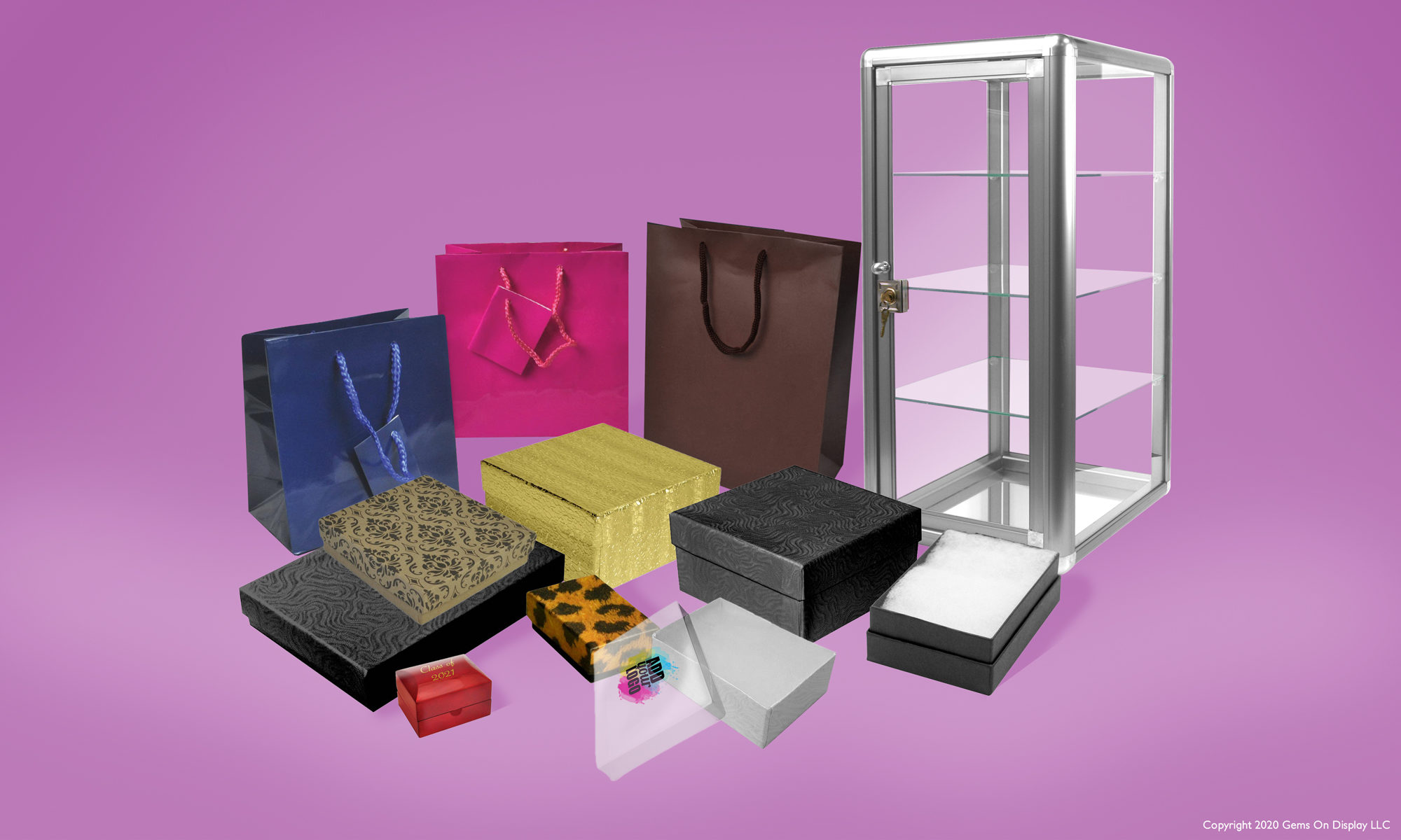
4. How about background colors?┬áThese are just as important as colors utilized in the front of a display! The background color is oftenÔÇöbut not alwaysÔÇöa neutral color (white, black, and beige are very popular, especially for jewelry displays), and should be an unequal blend of both warm and cool colors for the best effect. Although backgrounds should have a dominant color, when creating a booth or window display it can be good idea to have more than one color to avoid a dull background. Your background should push your products forward and not detract attention from them. For example, if you have red jewelry and a red background, your jewelry is likely to get lost in the background instead of standing out.

For a jewelry displays, if you have brightly colored jewelry, and you really want it to pop, a black or white display will help the jewelry to stand out.
Notice the picture to the right and how different a white pearl necklace looks on the black and white backgrounds. It creates a different feel on each display!
If we were to place the pearl necklace on a beige display, the look would be different, too! The beige and white would give it a feeling of beauty and elegance since they are colors similar to the pearl necklace, while the black really makes the white pearl stand out and catch your eye since it is a darker color.
For some great examples of color in displays visit us on Pinterest!