Spring is on the way! We donÔÇÖt know about you, but weÔÇÖre counting down the days until the weather warms up and we can see the ground again. In preparation for springtime days, we are are thinking about spring displays and spring colors.
Pantone’s Fashion Color Report Spring 2014 is a great place to begin. This will help you to see what colors are going to be trending this season, and you can choose what will match your jewelry and style the best. It will also help you highlight your pieces that might be similar to these colors or provide you with design inspiration.
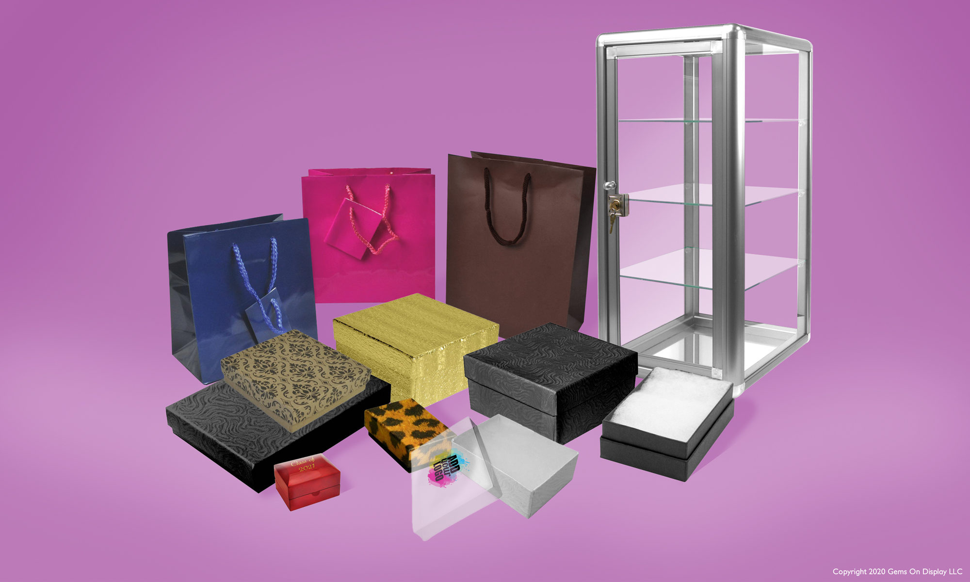
When choosing a color scheme for your displays, don’t go overboard and use ALL the colors. You want your jewelry to be the focus and your displays and props should serve only to bring attention to your jewelry. And when you’re choosing your spring packaging line, remember that packaging is branding. You want to create a look that customers will associate with your store even after they’ve gone home.

We know how many of our customers travel to shows, and one of favorite products for spring is this brand new carrying case! This black aluminum case has a front opening door with a pocket on the inside of the door, a hidden retractable handle, combination locks, and an adjustable divider. Holds up to (12) 1″ trays.

For more color inspiration for this spring, check out our Pinterest Bring in Spring board.