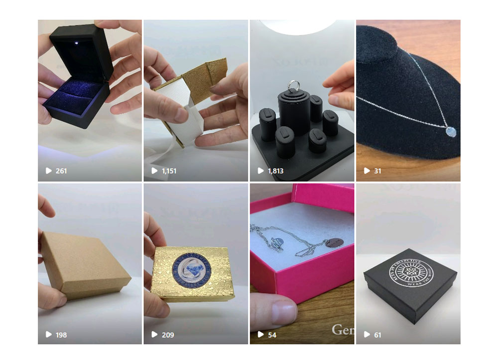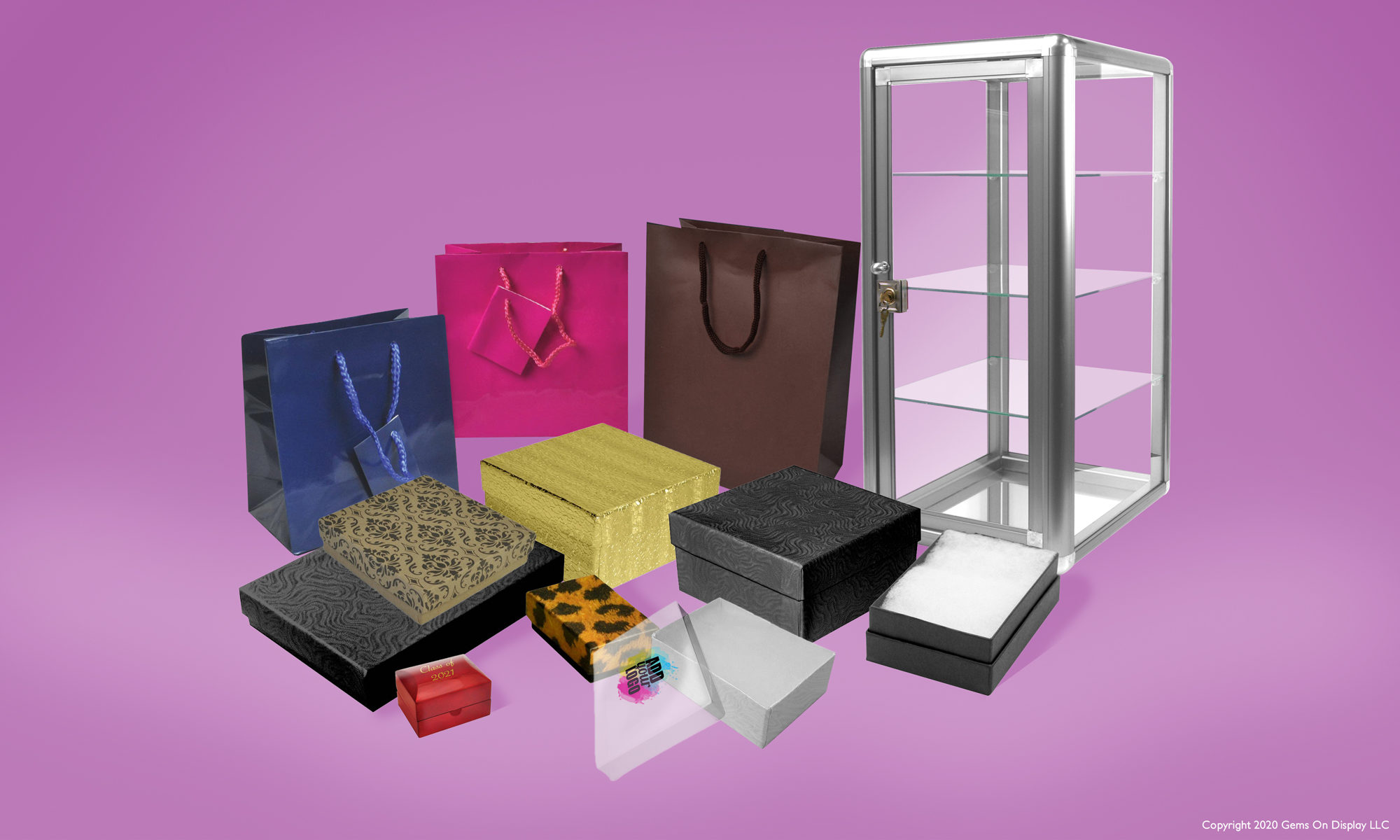
As a jewelry retailer, one of the most critical aspects of attracting customers to your store is the visual appeal of your window displays. An eye-catching and well-coordinated display can captivate passersby and draw them into your store. While the design and arrangement of your jewelry are undoubtedly essential, the color coordination of your displays plays a significant role in creating a compelling visual impact. Here’s how to pick the perfect color coordination for your jewelry displays:
Understand Your Brand Identity
Before diving into color choices, it’s crucial to understand your brand identity. Consider your brand’s personality, target audience, and the emotions you want to evoke. Are you a high-end luxury brand, a bohemian-inspired boutique, or a modern and minimalist jeweler? Your color choices should align with your brand’s image and values.
While it’s essential to be creative and flexible with your color choices, maintaining consistency across your displays is key to building brand recognition. Choose a cohesive color palette that reflects your brand identity and use it consistently across all your displays and marketing materials.
Consider your Jewelry with an Eye on Trends
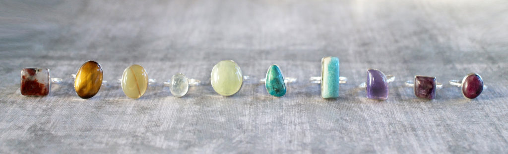
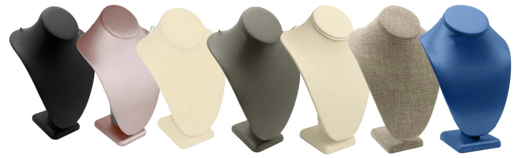
The color coordination of your displays should complement and enhance the jewelry you’re showcasing. Consider the materials, gemstones, and metals used in your pieces. For example, if your jewelry features vibrant gemstones like rubies or emeralds, consider a backdrop that allows these colors to pop. Alternatively, if your pieces are predominantly silver or gold, choose colors that accentuate their elegance and sophistication.
The season and current fashion trends can also influence your color choices. For example, vibrant and bold colors may be more suitable for spring and summer displays, while rich jewel tones or metallics may be perfect for fall and winter. Stay attuned to seasonal trends in fashion and design to ensure your displays remain fresh and relevant.
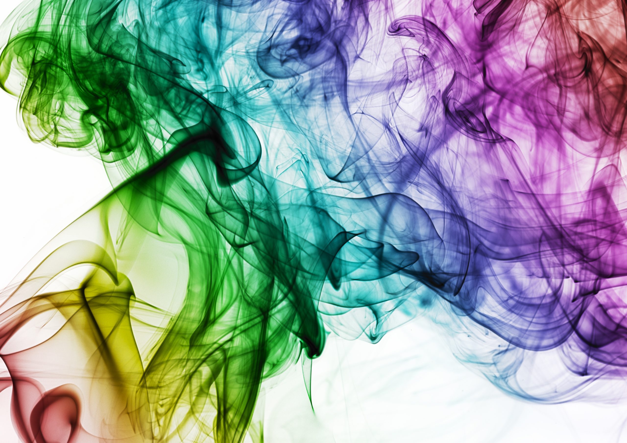
Use the Color Wheel
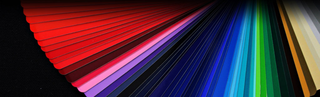
Understanding the basics of color theory can help you create visually appealing displays. The color wheel can be a valuable tool in selecting harmonious color combinations. Complementary colors, which are opposite each other on the color wheel (e.g., blue and orange or red and green), can create a striking contrast that grabs attention. Analogous colors, which are adjacent to each other on the color wheel (e.g., blue and purple or yellow and orange), can create a more subtle and cohesive look.
Don’t be afraid to experiment with different color combinations and arrangements. Set up mock displays in your store or use digital design tools to visualize how different colors will look together. Solicit feedback from colleagues or customers to gauge their reactions. Continuously refine and adjust your displays based on what resonates most with your audience.
Conclusion
In conclusion, selecting the perfect color coordination for your jewelry displays requires careful consideration of your brand identity, the jewelry you’re showcasing, color theory principles, seasonal trends, and the surrounding environment. By following these guidelines and leveraging your creativity, you can create visually stunning displays that captivate your audience and drive foot traffic to your store. Remember, the right colors can make all the difference in making a lasting impression on potential customers.